RGBWorkingSpace (RGBWS): Principles and Applications
Among PixInsight’s many processes, RGBWorkingSpace (hereafter RGBWS) is probably the most easily overlooked one. Many PI users don’t even know what it’s for. After adjusting its various parameters, the image doesn’t seem to show any visible effect, so they set it aside. But in fact, for deep-sky processing that needs to “extract luminance” or “add a luminance channel,” this process is critically important. This article is divided into two parts: first the principles of RGBWS, then its effect on color in actual processing.
Starting with the Human Eye: Why Green Looks Especially Bright
The human visual system is very sensitive to green light, so when computing luminance in a standard color space, green is assigned a far greater weight than red or blue.
Don’t believe it? Look at the pure RGB color image below. Doesn’t the green look especially bright, the red a bit less so, and the blue rather dark? This is precisely the result of the human eye’s weighting.
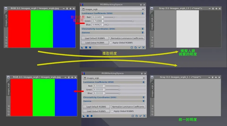
This kind of weighting is very appropriate for ordinary scenes lit by white light or daylight. But here’s the problem: green actually isn’t important in deep-sky images.
For example, Ha emission is deep red, and reflection nebulae are blue. For these objects, the red and blue channels hold most of the information, while the green channel usually contains only stars. OIII light is a mix of blue and green, and galaxies emit across the full spectrum. So, apart from a few planetary nebulae and some comet tails, in deep-sky images you usually can’t find any pixel that could be called a “green pixel” other than noise.
What RGBWS Does: Redefining the Luminance Coefficients
Given all this, we can use RGBWS in PI to define a set of luminance coefficients that “don’t match the physiology of the human eye,” so that the actual data from each channel gets treated more fairly. In other words, we make the three RGB channels contribute equally to luminance, thereby optimizing deep-sky processing.
Referring to the image above:
- The top half uses the Default RGBWS parameters (0.22 : 0.71 : 0.06), which match human vision, so the three pure-color luminances extracted are different, giving three grayscale images of different brightness.
- The bottom half sets all three channels to the same ratio (0.33 : 0.33 : 0.33), and you can see the three pure colors end up with exactly the same brightness, yielding a grayscale luminance image of identical value.
The luminance extracted in the two cases is completely different.
Note: RGBWS has nothing to do with color management or ICC profiles. It acts purely at the image-processing stage; don’t confuse the two.
Part Two: What Happens When You Add Luminance with the Wrong RGBWS Setting
Now that we understand the principle, let’s look at what happens when “adding a luminance channel” if RGBWS isn’t set correctly.
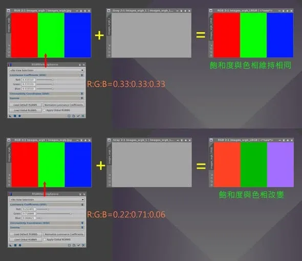
- Top half: the color image uses the “non-human-vision” ratio R : G : B = 0.33 : 0.33 : 0.33. After replacing the original luminance with a single-value grayscale image, the color image’s saturation and hue stay unchanged.
- Bottom half: the color image uses the “human-vision” ratio R : G : B = 0.22 : 0.71 : 0.06. After replacing the original luminance with a single-value grayscale image, the saturation and hue change.
Did you notice the blue? It has already turned purple.
By this point, you should be able to see just how important the RGBWS setting is when we want to “extract” or “replace” the luminance channel in a color image. It’s not an optional process, but the key step that decides whether the colors you worked so hard to capture can be preserved correctly.